Our idea was a shuttle, going from St. George, Ceder & Las Vegas to Brian Head, for youth that didn't have a means of transportation. It was geared towards 12-20 somethings and mostly the snowboarding crowd and their parents.
Group Roles:
Breanna: Created a Web Banner
Janet: Created the Vehicle Body Wrap
Jenilee: Created a Post Card Mailer
Keshara: Created the Website
Michael: Created the Logo
For my part, I made the Logo. But I also helped out with the overall style of the graphics used in the vehicle wrap, the website, the mailer and the web banner.
I have many years of experience in graphic design, and I love making graphics for skate competitions, so this was right up my alley.
American Beauty: The "It's just a couch" Scene Our roles:
- Director : Breanna
- Director of Photography : Mike
- Production Designer : Karli - Art Director : Megan
- Make-up & Wardrobe : Jill
Director of Photography - Video - The video director of photography (D.P.) is in charge of the overall visual look of the video, as seen through the camera. They recommend which cameras and lenses to use for the production. They design the shot's framing, and the camera movements in conjunction with the director. They are also in charge of the camera crew, lighting design and collaborating with the gaffer. Original DP for this film was Conrad L. Hall, listed as Cinematographer. He was DP on such memorable films as Road to Perdition and Marathon Man and television shows like The Outer Limits.
For American Beauty - the "It's Just a Couch Scene":
I would work closely with the Director, Art Director and Production Designer to see where to place the cameras and what the scene needs to have for shots. What is needed for the interaction in this scene.
I would also need to know what the wardrobe for the scene was, to make sure that there was no bright color that might not work with the lenses or camera settings I was using. So I would have to work with the Wardrobe department.
I would have to choose which lenses to use on the sound-stage/set, possibly a 50mm and a 30mm, maybe an 80mm in a few places, but keeping it wide in most of the shots seems to be what we would go for this kind of scene.
I would also make sure the lighting was used properly for the exterior lighting that comes through the windows, making sure it was the correct daylight effect. The film seems to be overcast most of the time, either because of the location of exterior shots and the time of year; or due to the mood of the film, making it an intentional decision to make it gloomy and sad weather wise.
Also coordinate the lights inside the room, if any are needed, to light the scene. In some cases the light from the windows might not be enough, but its hard to tell if additional light was used in this scene. There are a few dolly moves and camera tilts to time out. So that would be coordinated with the Director and Camera Assistant to make sure those went smoothly. Using the rule of thirds in each scene needs to be balanced out as well, and overall, it seems to be used for the entire scene, with the exception of the final scene where Carolyn goes up the stairs.
At the point where Lester moves in close to kiss Carolyn, the camera slides in for a tight shot on a dolly, moving in close for the intimate moment. But when Carolyn interrupts the kiss, just as she is about to let go, she breaks the mood with her comment about the couch and spilling beer, Lester moves back on the couch and away from her, then stands up, and the shots are wide again.
Overall, in each separate shot for this scene, the camera moves from far away at the beginning to closer, and then back out far away by the end of the scene. This was used to illustrate the moment visually, to bring the viewer into the scene with greater depth. The camera tilts down with her when Carolyn sits down, keeping her performance in frame at all times.
I love animated movies and I drove down to California this weekend. So, being exposed to a large amount of billboards might have played a role in this post.
I decided to take a look at some advertising for animated films. Specifically, the ones on billboards. You only get to see these for a moment if you are driving past, maybe 10 seconds. So the ads have to be good and catch your attention.
If you are a child who can't read the billboard, there has to be some imagery to get your attention, and make you want to ask your parents to take you to see that movie. This is what I found.
The Bad:
This isn't engaging, just large font. I know what it is, but will a child understand? It also doesn't show any hint as to what the film is about. It only gets creative with Megamind's head coming out of the top of the billboard, and that isn't much. Despite these plain billboards, the film did very well.
At least this one is trying to get the story behind the film in the ad. It shows the characters, some action, and it engages you a bit more, but I think they can do better. Take a look at the other "Lego Movie" ad below.
Again, large font, but what does it mean? I see some aliens peaking up around the edge of the frame, and alien ship over the top and I see what looks like Earth, but I'm not sure. Would a child understand this?
This ad is almost a mix of the "Megamind" style and the "Mars Needs Moms" one. The name is big and bold at the center. A few faces are peaking out of the snow around the bottom, and Olaf is centered. While not the main character of the film, I'm sure this is an attempt to appeal to the child that sees this ad and knows the character from the commercials in the theaters. He is also breaking through the edge, like Megamind.
The Good:
This is simple. It uses bright orange to grab the viewers attention and a third dimension which isn't the easiest thing to do with a billboard. For a child, it will either scare them or make them laugh. Right away, they know its for them. The words are small and off to the side, making the face of the Lorax draw your attention.
This one is good to talk about juxtaposed with the other "Lego Movie" billboard. The first example had a flat image and didn't break out of the edges of the frame. This version on the other hand appears to explode not only from all sides, but also out towards the viewer. It looks like the lego characters are about to fly off the billboard and right at you with a little depth of field and motion blur. This one definitely grabs a child's attention, and maybe even, their imagination, which is what lego is all about.
I know this isn't much of an example, but I like how they used the billboard in a way that looked like it was tampered with by the characters of the film. If anyone has seen "Monsters Inc.", and most children have, then I would think that they know Mike and Sulley. It uses the edge as a barrier for Sulley to hide behind, and Mike almost looks like a three dimensional solid taped to the billboard. Also, the simple letters, M and U are easy for a child to read. Giving them a reward when they understand the meaning, ingenious.
For this one, I think they were just going for a laugh. But the use of the edges and the shading to make the feathers look as if they are not part of the billboard, but floating in front of it. This is a great way to make it stand out. Again the small letters don't clog up the image, so young viewers get the idea. Even the glasses look like they are popping off the billboard.
Closing:
I feel like I can judge the designs as good or not, but from a child's perspective, I'm only guessing at what works on that level. I'd like to share a video with some creative uses of the space on and around the billboards that I stumbled across in my research for this topic. Enjoy.
This was my son's first burger at In-n-Out. I wish I'd gotten a little lower to hide the stools behind him better and if I'd had a better lens with a shallower depth of field, maybe a prime 50mm, I could have given more impact by setting it between his nose and hands. I like the way that the red chair curves into his back and seems to come out on the other side as his shirt. There is also a balance in the red upper left and the darker gray on the lower right. I have to admit, its not one of my better photos, but it captures the moment of his first burger.
I took this in Moab, UT. On a trip to Arches, my brother-in-law posed for me under one of the arches. I like how he is placed low in the frame, while the arch hangs over him.
A group guide in Peru. She had a great smile and was a fun person to learn about the culture and history from. This is a good example of the rule of thirds, because I have her framed to the right, while the stairs up to the ruins or out of focus to the left. With only a few color pops in the back ground, the green and the blue, the image is almost all browns, flesh tones and white.
This woman offered to be my wife, as part of the exhibition they gave us. We learned how they made the dies to color their cloth. Unfortunately I was already married and my wife was there to protect me. I like this picture because it looks like a dutch angle, but she is actually leaning to the side while I was square with her. The bowl she is using and the hat she wears makes an interesting balance in the frame.
I just couldn't get enough of the women in uniform in Cusco. I wish I'd noticed that the guy walked through as I took this, because she moved away not long after that and I wasn't able to capture a better shot of her. She was riding a motorcycle around the town square.
One night, I stayed in a campsite near a small mountain town along the Inca Trail. Outside my tent was this cute fella tied to a tree who was also my alarm clock that morning. My favorite part of this picture is the hair and the texture it ads to his face. Then there is the bridle made of a nylon weave or something hand made there in the mountains. It has another texture and color that draws a line around his face. He is framed in green almost all around, with just a hint of blue sky in the upper left.
I have so many things I'd want to talk about, and I couldn't choose just one, so I picked 3.
Art: Oath of the Horatii by Jacques-Louis David
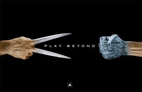
- I love this piece. I like how its broken into 3 registers by the arches in the background and each part of the scene is telling different parts of a story. Its about Loyalty and Patriotism, but you have to know the story to understand the details. Even so, from the emotions and poses, you can understand the feelings it can cause. Design: Sony "Play Beyond" Playstation Ad Campaign
- I've always been a huge fan of Playstation, ever since the first console came out. Sony has had many successful ad campaigns, but they always seem to die out to soon. The "Live in your world, Play in ours" was another of my favorites, and to this day, I still quote it. That was the slogan in the late 90's and its 2014. I don't know if that kind of stay power exists with other gamers, but it seems to have worked with me. Sculpture: Pieta by Michelangelo
- I always have a feeling of awe and wonder at the detail and time that went into a piece like this. My favorite periods are Classic Greek and Hellenistic. What I look at is the posture, the head facing down, the draped fabric, the slumped body of Christ. In another Spanish Pieta, that is made of wood, the image has more pain in the face and even red ink stained into the arms and head to mimic blood.