Wednesday, February 28, 2018

Presence in Video Games & Beyond


When a person sits down to play a video game, they do it as an escape. They are trying to get away from the stress of the day or week and go on an adventure without spending money, gas or time getting there. Sure, a game might cost $60, but that is far less than what it would be to drive to Yosemite for the weekend. Not to mention, a person can’t fight a dragon at Yosemite nor can a person fly a ship into space with their spare time. Video games offer a special escape for millions of gamers everyday.

Miller (2011) refers to the current generation of video games as having a combination of telepresence and sensory depth. In my experience, the sensory depth is only limited by smell and taste in the current generation of games. Visual and audible stimuli have reached amazing fidelity and only have so much more room to grow. Even touch has been taken care of with vibrating controllers, although in the future, we may have more detailed touch feedback devices.


My wife once called a tech support line that was based in India. Her brief interaction with the representative on the other end of the line was a perfect example of presence. While on the line, a train went by our apartment and the man in India asked what that was. My wife told him and he was so excited to be hearing a train in America while in his cubicle in India. In that moment, the representative in India was transported in his mind into our apartment. He was there with us, if only briefly, through his own imagination with a single sound.

In video games, sound wasn’t always as important as it is today. Sounds used to be simple beeps and pongs. Now, there are foley artists at every game studio who spend hours compiling sound effects, music and menu sounds for video games. The Assassins Creed series is a prime example of high end sound at work. Gamers play an assassin in an ancient world. The player can walk down a street in Venice, hear a man selling fruit, birds chirping, women singing, water bubbling, the list is endless. This rich environment is enhanced with sound, adding to the presence with detail never before imagined in gaming. Visually, you still may feel like you are playing a game at times, but audibly you can be whisked away into another place in another time.


Video games are not the only arena to utilize presence in this way. Thompson (2012) writes about a boy who attends school via robot. He sits at home and virtually goes to his classes due to an extreme reaction to allergies, he is experiencing presence at school in this way. In another case, Thompson (2012) refers to the use of remote arms in surgery where a doctor in New York removed the gall bladder of a woman in France, over 6,000 miles away.

The U.S. military has been using drones in the war against terrorism since 2002. Pilots in an air force base in Nevada are able to fly a small craft carrying weapons in Afghanistan. These can be used to attack targets on the ground. This effectively removes the danger of flying a mission from the mind of the pilot. It may also remove the remorse felt that usually comes with taking another person’s life. Grossman (2013) found that the U.S. military had carried out 447 drone attacks in Afghanistan in the first few months of 2012. It resembles a toy or pet and in many ways, a video game. This could even be tied to video game violence.


In a study by Nowak, Krdmar & Farrar (2008) 227 subjects were randomly assigned to play both violent and nonviolent video games. The study found that the higher level of presence was tied to the frequency of playing video games. Also, males were less subject to presence than female gamers. The study also found that the more violent the video game was, the more presence there was felt by the participant. This increase in presence also caused an increase in hostility when playing violent games. Subjects became more verbally aggressive than those that experiences less presence.

As an avid gamer, this researcher doesn’t see himself as a violent person. But, this researcher also doesn’t play as many violent games as the younger gaming population of today might. this researcher uses gaming as a way to relax and get away from life for a while. If it’s a violent game to the extent that I’m repulsed, this researcher doesn’t play it. this researcher prefers a game with greater presence, to draw him in and take him to another world for a while. Ultimately, this researcher thinks that is what video games should be about, the experience. Presence is a huge tool in the gaming industry. For games like Grand Theft Auto, Mass Effect, Assassins Creed, Uncharted and more, presence is the most important reason people are playing those games. They are more than a game. They are a story, a story that if told without the detailed level of sensory depth, just wouldn’t be as much fun.


REFERENCES

Grossman, L. (2013). Drone Home. Time 181(5), pp. 26-33.
Thompson, H. (2012). Here, there, virtually anywhere. New Scientist. 216(2890), pp. 38-41.
Miller, V. (2011). Understanding Digital Culture. pp. 31-32. London: SAGE Publications, LTD.
Nowak, K; Krcmar, M; Farrar, K. (2008). The Causes and Consequences of Presence: Considering the Influence of 
   Violent Video Games on Presence and Aggression. Presence: Teleoperators and Virtual Environments. 17(3). pp 256-268.

Thursday, December 24, 2015

Florence American Cemetary


While in Italy, my family was able to visit a fallen family member who was lost in WWII. My great uncle Pvt. Frank J. Nagy, died in Italy on April 22, 1945. Ironically, this was the same day that Hitler admitted defeat after Russian forces overtook Nazi defenses in Treuenbrietzen, 40 miles southwest of Berlin. Although it wasn't until May that the German Forces surrendered.


When approaching the memorial, surrounded by forests on all sides, there is a small bridge one must cross before approaching the actual head stones. The valley is clearly visible from a major highway and looked after by two caretakers. There are over 4000 American soldiers buried on the 70 acres of land given to the United States by the country of Italy.


The two small buildings that flank the bridge before crossing into the memorial space are used by the care takers and visitors. One is an office for the care takers to use in their daily tasks. The other is a small state room and bathroom area for visitors. Around the state room are brochures in English and Italian explaining what the memorial is and where to find a specific soldiers headstone. Also in this room are flags visitors may take out to be placed in memory of a loved one, fallen in battle.


My great uncle Frank was located easily thanks to the location given to me by my uncle James, and I took a moment to think about Frank, his service and sacrifice.


My son placed a flag in Frank's memory and asked lots of questions about the memorial.


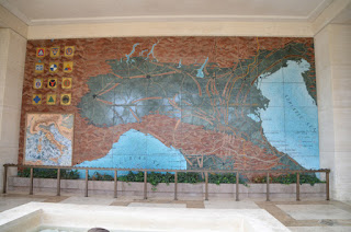
We then walked up to the memorial buildings which are filled with more information about the war, a marble mosaic map of the movements of the Allied troops in Italy, and a chapel.


Each wing is dressed with fountains in a central space, surrounded by recessed spaces filled with text related to the soldiers buried in the cemetery, the unknown soldiers, and the missing. A large wall lists all of the unaccounted for soldiers by name.


There is one solider listed in the memorial who was given the Medal of Honor and 5 groups of brothers who are buried together as well.


It was a beautiful place, well suited for the memorial. I was honored to be the first person from our family to make the trip. It took 2 attempts, several buses and a few hours of confusion; but it was well worth every minute.


Thanks to my uncle James Nagy for reminding/suggesting that I make the trip to this wonderful memorial while I was close to the location. I hope this serves as a testament to my great uncle Frank Nagy and what he did for our country.

Tuesday, December 9, 2014

Final Project - Brian Head Sled

Our idea was a shuttle, going from St. George, Ceder & Las Vegas to Brian Head, for youth that didn't have a means of transportation. It was geared towards 12-20 somethings and mostly the snowboarding crowd and their parents.

Group Roles:
  Breanna: Created a Web Banner
  Janet: Created the Vehicle Body Wrap
  Jenilee: Created a Post Card Mailer
  Keshara: Created the Website
  Michael: Created the Logo

For my part, I made the Logo. But I also helped out with the overall style of the graphics used in the vehicle wrap, the website, the mailer and the web banner.

I have many years of experience in graphic design, and I love making graphics for skate competitions, so this was right up my alley.

Style Guide:

Main Logo: 

Thursday, November 6, 2014

Mise-en-Scene : American Beauty

American Beauty: The "It's just a couch" Scene

American Beauty 2.jpg

Our roles:

- Director : Breanna
- Director of Photography : Mike
- Production Designer : Karli
- Art Director : Megan
- Make-up & Wardrobe : Jill

Director of Photography - Video - The video director of photography (D.P.) is in charge of the overall visual look of the video, as seen through the camera. They recommend which cameras and lenses to use for the production. They design the shot's framing, and the camera movements in conjunction with the director. They are also in charge of the camera crew, lighting design and collaborating with the gaffer.
Original DP for this film was Conrad L. Hall, listed as Cinematographer. He was DP on such memorable films as Road to Perdition and Marathon Man and television shows like The Outer Limits.

For American Beauty - the "It's Just a Couch Scene":

  • I would work closely with the Director, Art Director and Production Designer to see where to place the cameras and what the scene needs to have for shots. What is needed for the interaction in this scene.
  • I would also need to know what the wardrobe for the scene was, to make sure that there was no bright color that might not work with the lenses or camera settings I was using. So I would have to work with the Wardrobe department.
  • I would have to choose which lenses to use on the sound-stage/set, possibly a 50mm and a 30mm, maybe an 80mm in a few places, but keeping it wide in most of the shots seems to be what we would go for this kind of scene.
  • I would also make sure the lighting was used properly for the exterior lighting that comes through the windows, making sure it was the correct daylight effect. The film seems to be overcast most of the time, either because of the location of exterior shots and the time of year; or due to the mood of the film, making it an intentional decision to make it gloomy and sad weather wise.
  • Also coordinate the lights inside the room, if any are needed, to light the scene. In some cases the light from the windows might not be enough, but its hard to tell if additional light was used in this scene. There are a few dolly moves and camera tilts to time out. So that would be coordinated with the Director and Camera Assistant to make sure those went smoothly. Using the rule of thirds in each scene needs to be balanced out as well, and overall, it seems to be used for the entire scene, with the exception of the final scene where Carolyn goes up the stairs.
  • At the point where Lester moves in close to kiss Carolyn, the camera slides in for a tight shot on a dolly, moving in close for the intimate moment. But when Carolyn interrupts the kiss, just as she is about to let go, she breaks the mood with her comment about the couch and spilling beer, Lester moves back on the couch and away from her, then stands up, and the shots are wide again.
  • Overall, in each separate shot for this scene, the camera moves from far away at the beginning to closer, and then back out far away by the end of the scene. This was used to illustrate the moment visually, to bring the viewer into the scene with greater depth. The camera tilts down with her when Carolyn sits down, keeping her performance in frame at all times.

Wednesday, October 22, 2014

Composing a Frame

I searched through my photos from the past few years and also took some new ones at the petroglyph canyon in Snow Canyon.
This is the result.

Vectors

I took this one in San Francisco while walking through Chinatown.


This was on the way to Idaho, somewhere in Nevada, last summer.


Squirrel on the walk through the Hot Springs in Yellowstone.

Diagonal

Petroglyphs in Snow Canyon.


Bridge over Flaming Gorge, with an Osprey flying over.


Petroglyphs in Snow Canyon.

Rule of Thirds

Experiments with light.


Petroglyphs in Snow Canyon.


Petroglyph Trail in Ivins.

I feel like a few of these contain both diagonal and rule of thirds elements, but I wanted to balance out the images through the page. 
I hope that was alright.


Saturday, September 20, 2014

Design Evaluation

Design in Campaign:

I love animated movies and I drove down to California this weekend. So, being exposed to a large amount of billboards might have played a role in this post.

I decided to take a look at some advertising for animated films. Specifically, the ones on billboards. You only get to see these for a moment if you are driving past, maybe 10 seconds. So the ads have to be good and catch your attention.

If you are a child who can't read the billboard, there has to be some imagery to get your attention, and make you want to ask your parents to take you to see that movie. This is what I found.

The Bad:


This isn't engaging, just large font. I know what it is, but will a child understand? It also doesn't show any hint as to what the film is about. It only gets creative with Megamind's head coming out of the top of the billboard, and that isn't much. Despite these plain billboards, the film did very well.


At least this one is trying to get the story behind the film in the ad. It shows the characters, some action, and it engages you a bit more, but I think they can do better. Take a look at the other "Lego Movie" ad below.


Again, large font, but what does it mean? I see some aliens peaking up around the edge of the frame, and alien ship over the top and I see what looks like Earth, but I'm not sure. Would a child understand this?


This ad is almost a mix of the "Megamind" style and the "Mars Needs Moms" one. The name is big and bold at the center. A few faces are peaking out of the snow around the bottom, and Olaf is centered. While not the main character of the film, I'm sure this is an attempt to appeal to the child that sees this ad and knows the character from the commercials in the theaters. He is also breaking through the edge, like Megamind. 

The Good:


This is simple. It uses bright orange to grab the viewers attention and a third dimension which isn't the easiest thing to do with a billboard. For a child, it will either scare them or make them laugh. Right away, they know its for them. The words are small and off to the side, making the face of the Lorax draw your attention. 


This one is good to talk about juxtaposed with the other "Lego Movie" billboard. The first example had a flat image and didn't break out of the edges of the frame. This version on the other hand appears to explode not only from all sides, but also out towards the viewer. It looks like the lego characters are about to fly off the billboard and right at you with a little depth of field and motion blur. This one definitely grabs a child's attention, and maybe even, their imagination, which is what lego is all about.


I know this isn't much of an example, but I like how they used the billboard in a way that looked like it was tampered with by the characters of the film. If anyone has seen "Monsters Inc.", and most children have, then I would think that they know Mike and Sulley. It uses the edge as a barrier for Sulley to hide behind, and Mike almost looks like a three dimensional solid taped to the billboard. Also, the simple letters, M and U are easy for a child to read. Giving them a reward when they understand the meaning, ingenious.


For this one, I think they were just going for a laugh. But the use of the edges and the shading to make the feathers look as if they are not part of the billboard, but floating in front of it. This is a great way to make it stand out. Again the small letters don't clog up the image, so young viewers get the idea. Even the glasses look like they are popping off the billboard.

Closing:

I feel like I can judge the designs as good or not, but from a child's perspective, I'm only guessing at what works on that level. I'd like to share a video with some creative uses of the space on and around the billboards that I stumbled across in my research for this topic. Enjoy.


Thursday, September 11, 2014

Gestalt: Eccles Building

Law of Similarity:


Law of Proximity:


Law of Pragnanz:


Law of Continuity:


Law of Closure: